Create distinct but cohesive work
How do you create distinct but cohesive works that are inspired by your earlier works? And, why make the effort to do this?
Making new works based on previous pieces is one way I was able to jump full throttle into doing Abstracts. By reimagining older works into new I didn’t waste time searching for inspiration.
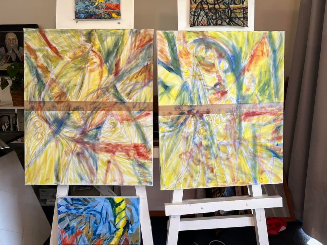
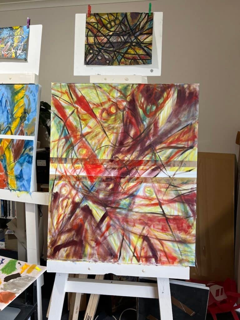
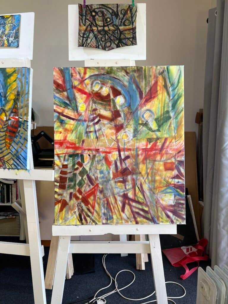
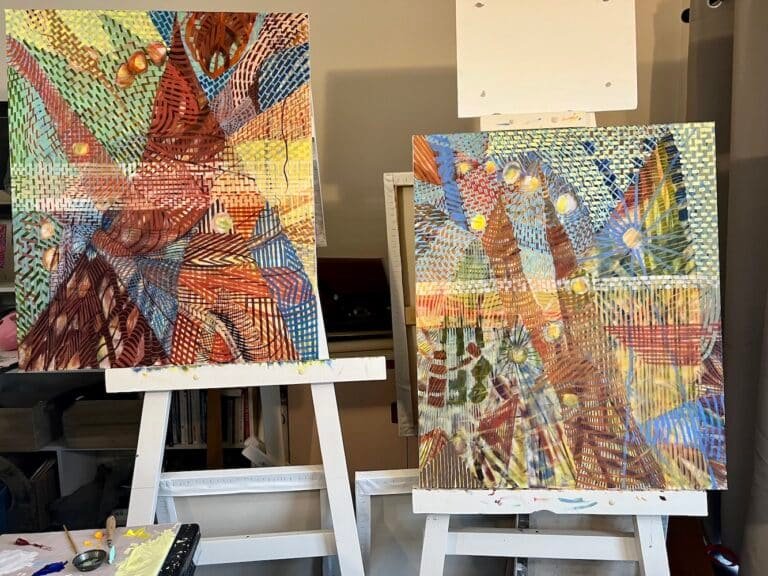
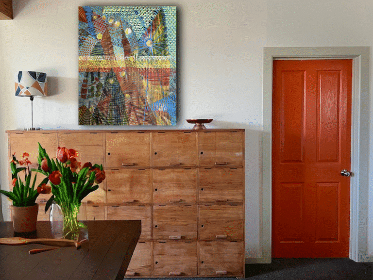
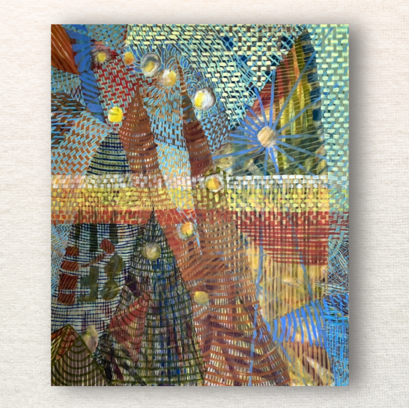
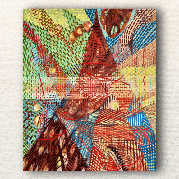
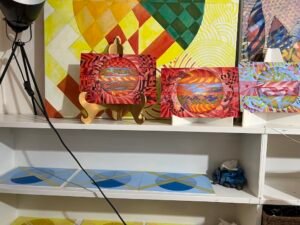
The ‘Mountain Collection’ works, given working titles, ‘WSXL1’ and ‘WSXL2’, focus on mountain-like motifs within “Scamper and Scoot” and “Revel and Rejoice”.
The following considerations will help you develop new distinct works based on works you previously created. Yet, you’ll enhance discourse throughout your overall collection of work.
Re-imagine themes, motifs, and processes
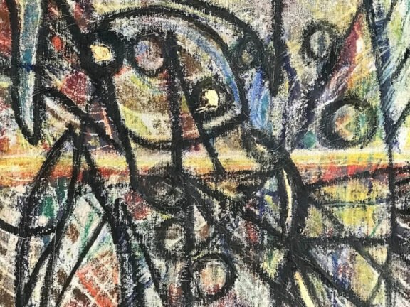
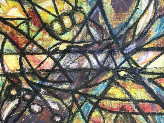
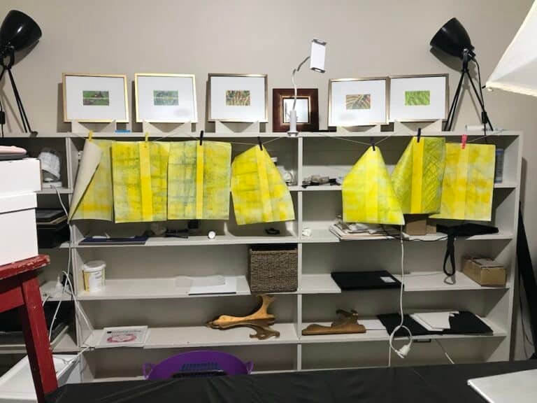
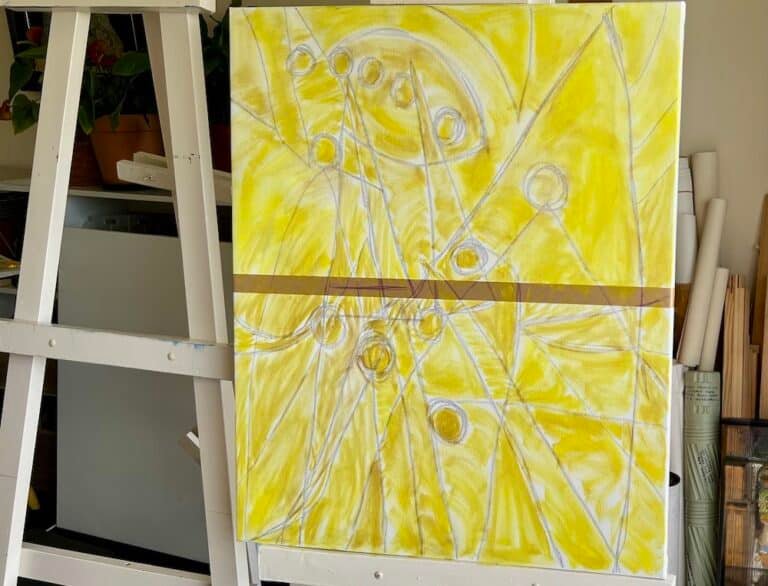
One way to add cohesion between older and a new work is to replay a process or theme from the earlier piece. Just as I had begun with same colour of oil-based printing ink in the “Moving On” works, likewise, I brushed lemon yellow to larger works. Furthermore, I applied many layers of cooler primary colours in a textural fashion.
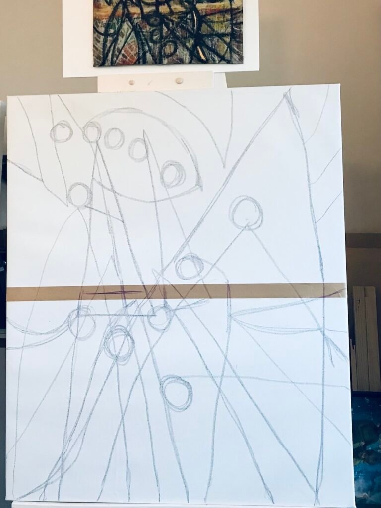
I reinforced the horizon lines, additionally, by placing and removing masking tape throughout the early stages of the new pieces.
Change Up Medium
For the Mountain Works (‘WSXL1’ and ‘WSXL2’) there is huge relief in returning to oil paint, a medium with which I’m very familiar. After months of struggling with unfamiliar oil-based print ink and mono-printing with Inktense, it was a relief to work with oil again.
However, persisting with an unknown medium and technique taught me a lot. Therefore, I now purpose to NOT simply end up with a bigger version of the inspiring works. In this familiar setting, I pushed boundaries with oil paint in order to pursue that which was, nonetheless, uncomfortable.
This is why I highly recommend you embrace using an unfamiliar medium or technique. It helps you re-imagine your work. Click here to read “The Challenge of Printing with Oil-Based Ink”. It tells about my earlier studio experience with the unfamiliar.
Change Orientation
Another way to help you develop new from old is to change the orientation. This enforces subtle design changes in the layout, thereby rendering a new composition. Additionally, doing this makes new problems to solve. Problem solving always boosts creativity.
Reinterpret Patterns, Shapes, and Design
Another way to maintain connection is to reinterpret the movement of an earlier work. Look for patterns and shapes you can express in a new way.
For example, in ‘WSXL1’ I used earth tones blocks to reinforce shapes and structures found in ‘Scamper and Scoot’, being careful to remain subtle. I used cooler and darker earth tones on WSLX2′ to add movement, rhythm, and linear structure.
Stripes added a sense of form and depth. Additionally, I found the interaction between the coloured lines and the layers beneath them enjoyable. The combination guides the eye back into the composition and adds direction.
I reinterpreted the horizon line as well. In WSXL2, I added earthy yellow lines across the middle.
Later, I extended the colour down the right side to prepare for new treatment, after the paint set.
Allow the new to assume its own destiny
I constantly looked back to the older work to search for clues to use on the new one. This stage lasts for several sessions. However, there is a point at which the new work assumed its own destiny. I no longer needed to refer to the old.
Commit to the newly developed theme
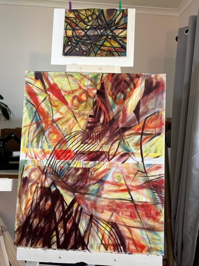
Commitment to the new derived theme is another milestone. I committed to the weave pattern and used it to give direction around both compositions.
Neutral off-white horizon lines helped ground WSXL2 to “Revel and Rejoice” as well as WSXL-1
I came back in with a cooler earthy red to accentuate the horizon zone of WSXL2. Next, I added a weaving effect with the cool mint green lines. This served to keep the eye following the horizon off the page.
Look for a tie-in with your overall body of work
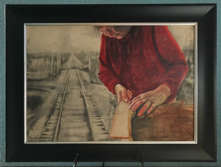
Rahab’s thread was then added to WSXL 2. A symbol of connection and hope, it was first used in my earlier narrative realism collections, Ephemeral Perception and Out of Hand. The cord now serves to wind around and highlight mountain shapes, giving them volume. I like the contrast and slight solemnity the textural strokes give this playful work.
Lessons learnt from ‘Mountain’ works
One significant lesson I’ve learnt is that being uncomfortable, even seeking creative discomfort, is vital. If I sense that I’m getting too comfortable with a piece, I add a “go bold or go home” mark, which I’ve done several times in these new works. These marks have the power to ruin or elevate a work because they create strong problem to solve.
In Summary
Cohesion and continuity in your overall body of works is good. You want your collection of works to have a language so they can relate to each other in a style identifiable as yours. It allows collectors to enjoy the development of your oeuvre.
Completing ‘Go Tell It On The Mountain’ and ‘Mountain Moving Time’
Returning from my restful summer break, I revisited “Go Tell It on the Mountain” and “Mountain Moving Time” with fresh eyes. I was really pleased. I simply needed to add a more robust red to Rahab’s Thread on “Mountain Moving Time” to complete that work.
What I achieved
Did I achieve what I was hoping to? Yes, I did.
For me, these are ground breaking works. Moreover, I wanted them to feel somewhat uncomfortable, which they certainly do, but at the same time, they inspired me to continue the motif. I believe the summer break helped me appreciate this.
The theme developed in these two works are helped me unearth my own style of creating abstracts.
Now, they need a re-stretch from the pounding they took from applying the paint. Next, I’ll follow up with varnish, when Rahab’s thread is completely dry. Then they’re ready to go.
Join my email list be notified when the newest large canvas works go live in my store. Plus, you’ll get email list only special prices.
Further Reading
“Artistic consistency is a crucial yet often overlooked aspect of an artist’s career.” writes Jason Horejs in his thorough article ambitiously titled “The Ultimate Guide to Mastering Artististic Consistency for a Successful Art Career”, which can be read by clicking here.
