


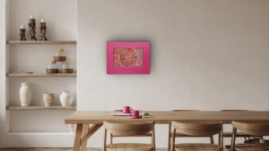
How does the Pink Chatter collection fit into your Cloud Dancer spaces? Furthermore, does the 2026 Pantone Colour of the Year announcement matter?
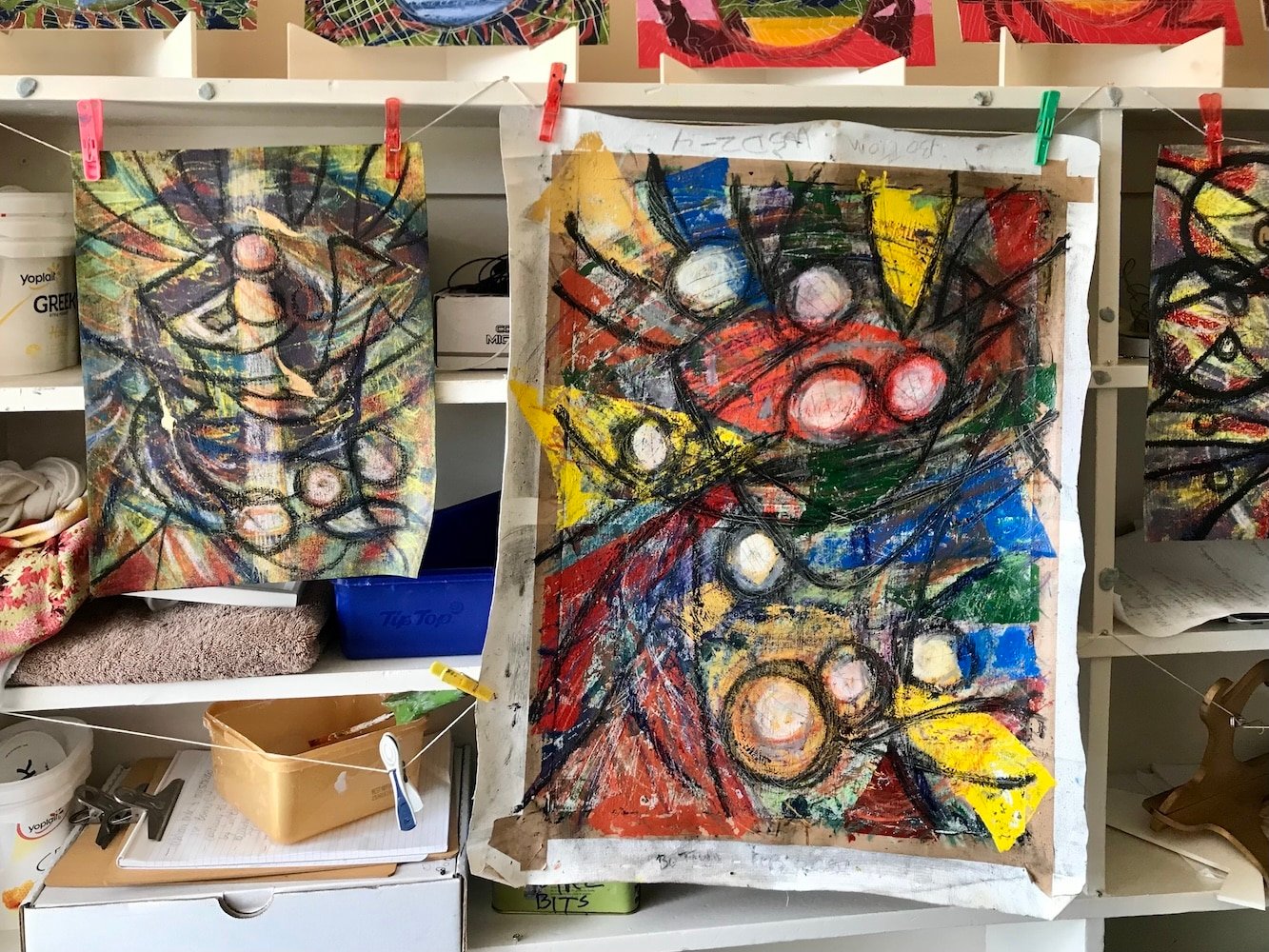
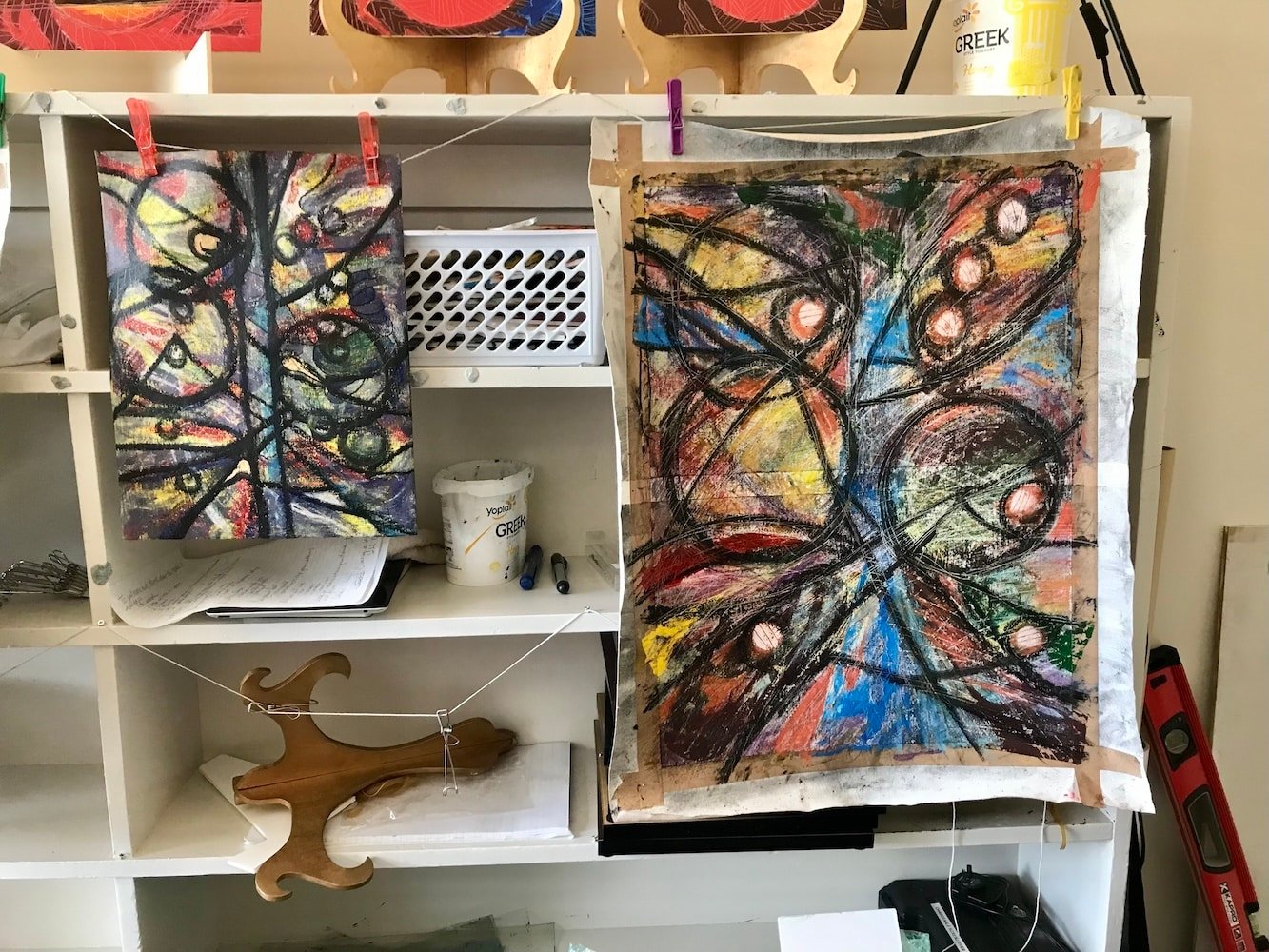
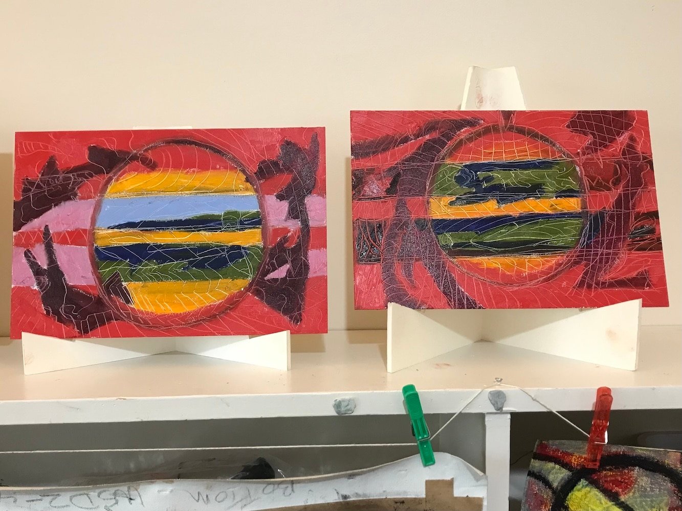
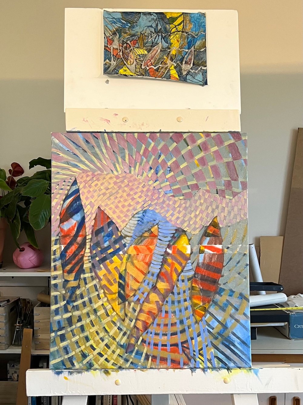
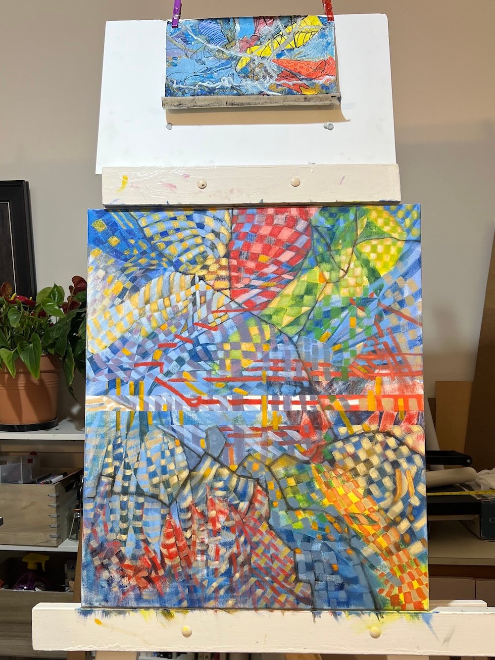
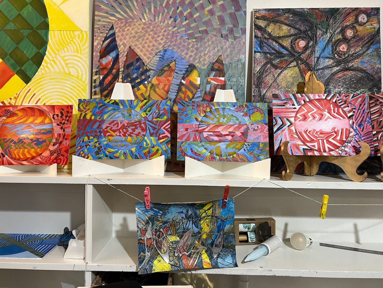
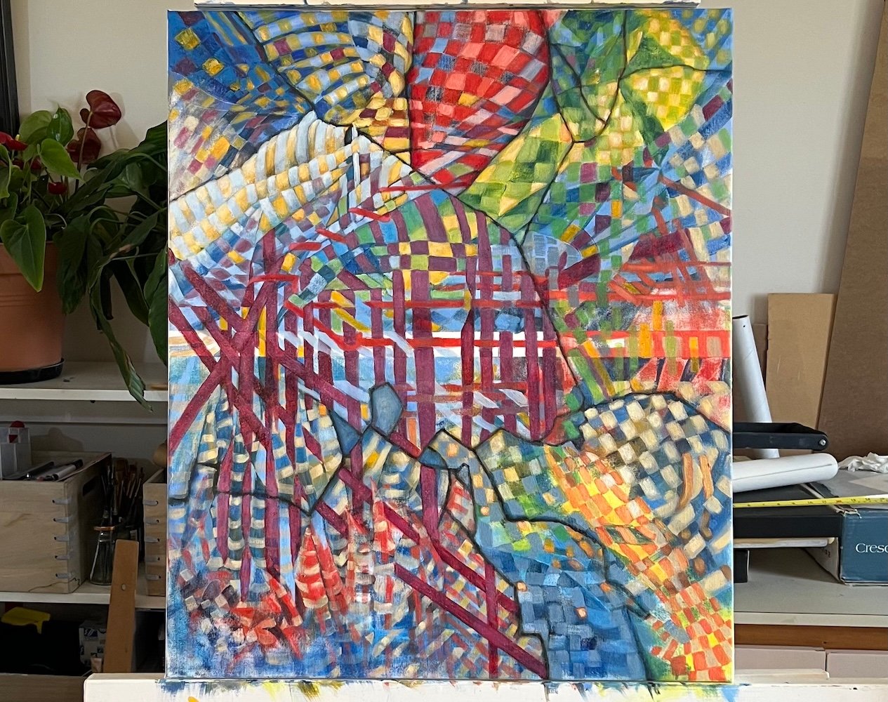
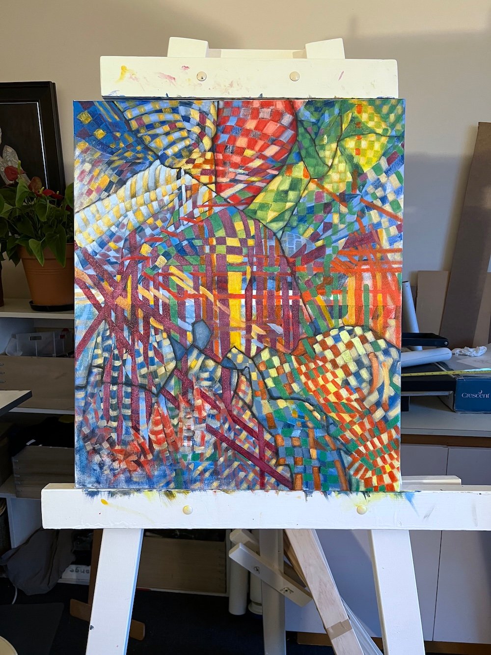
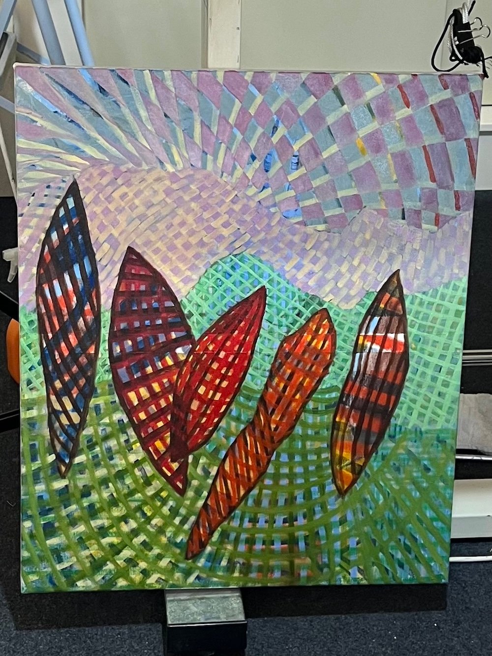
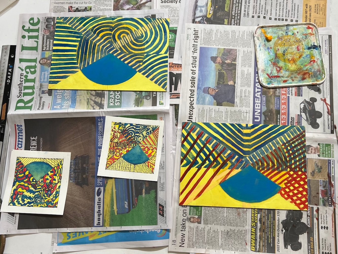
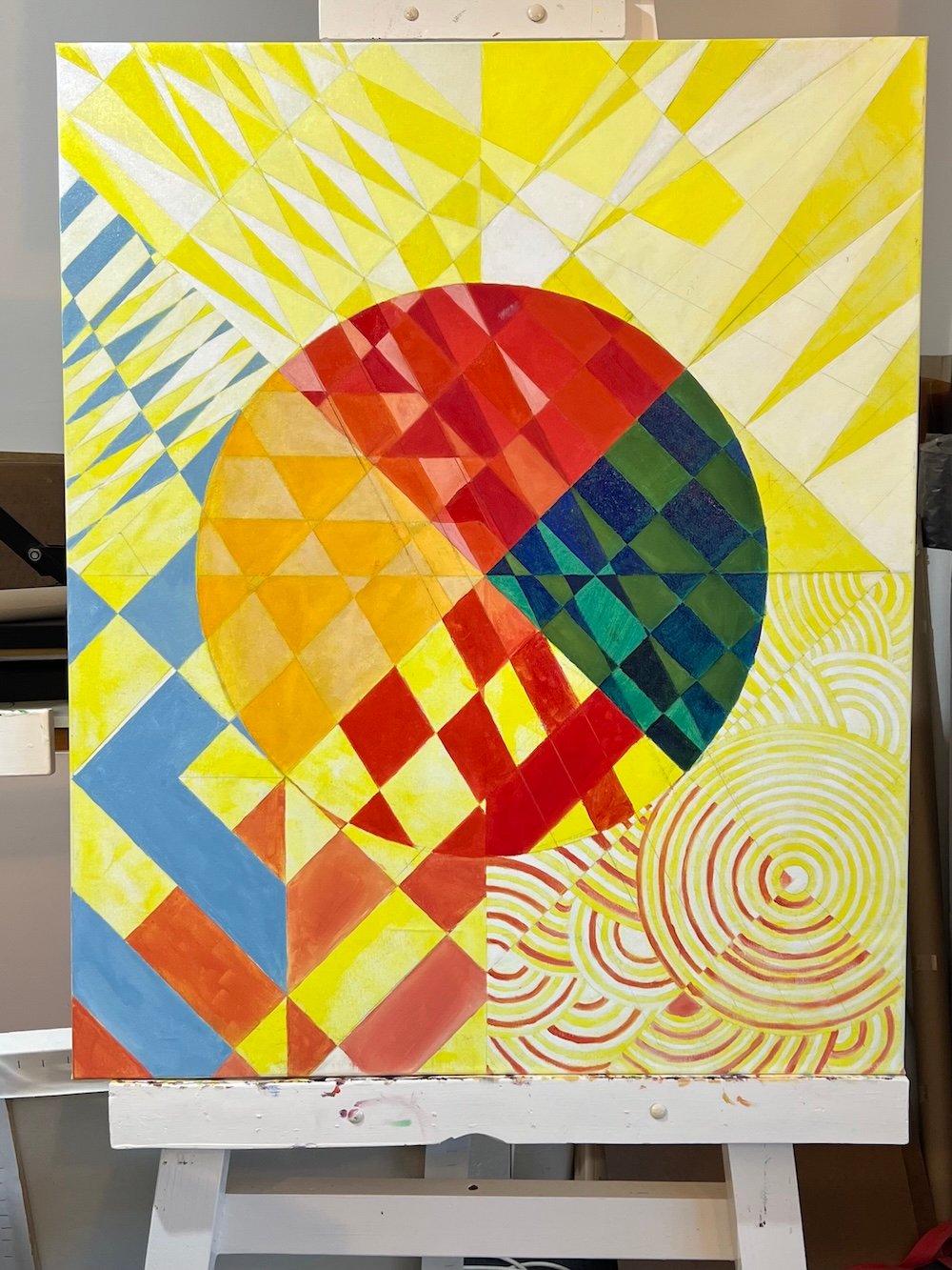
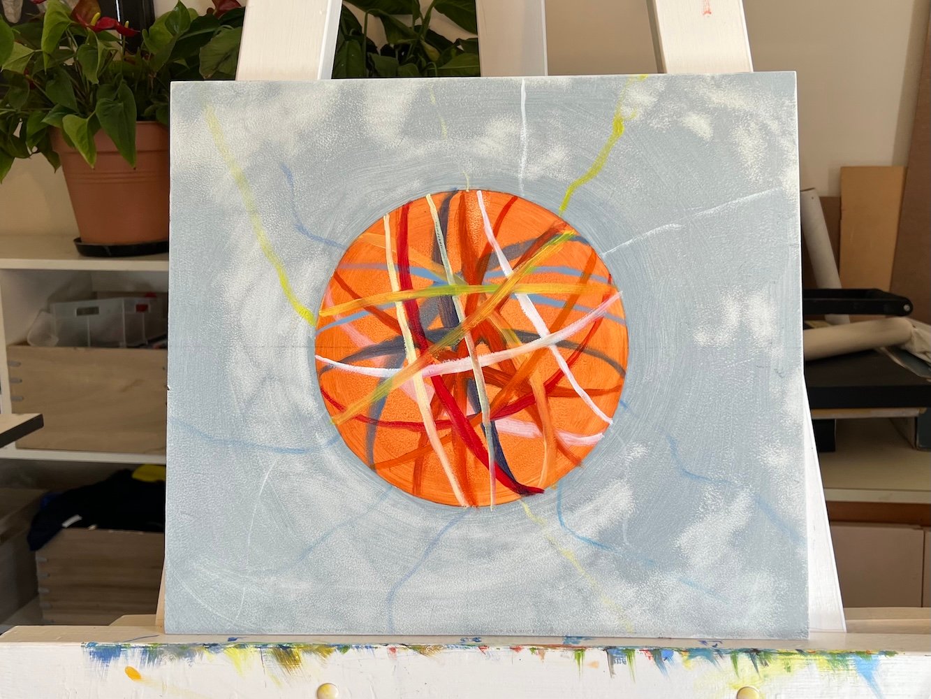
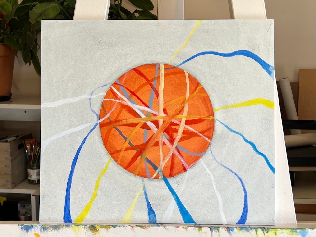
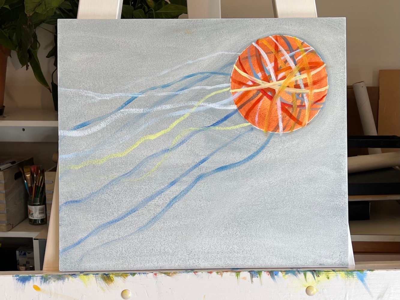
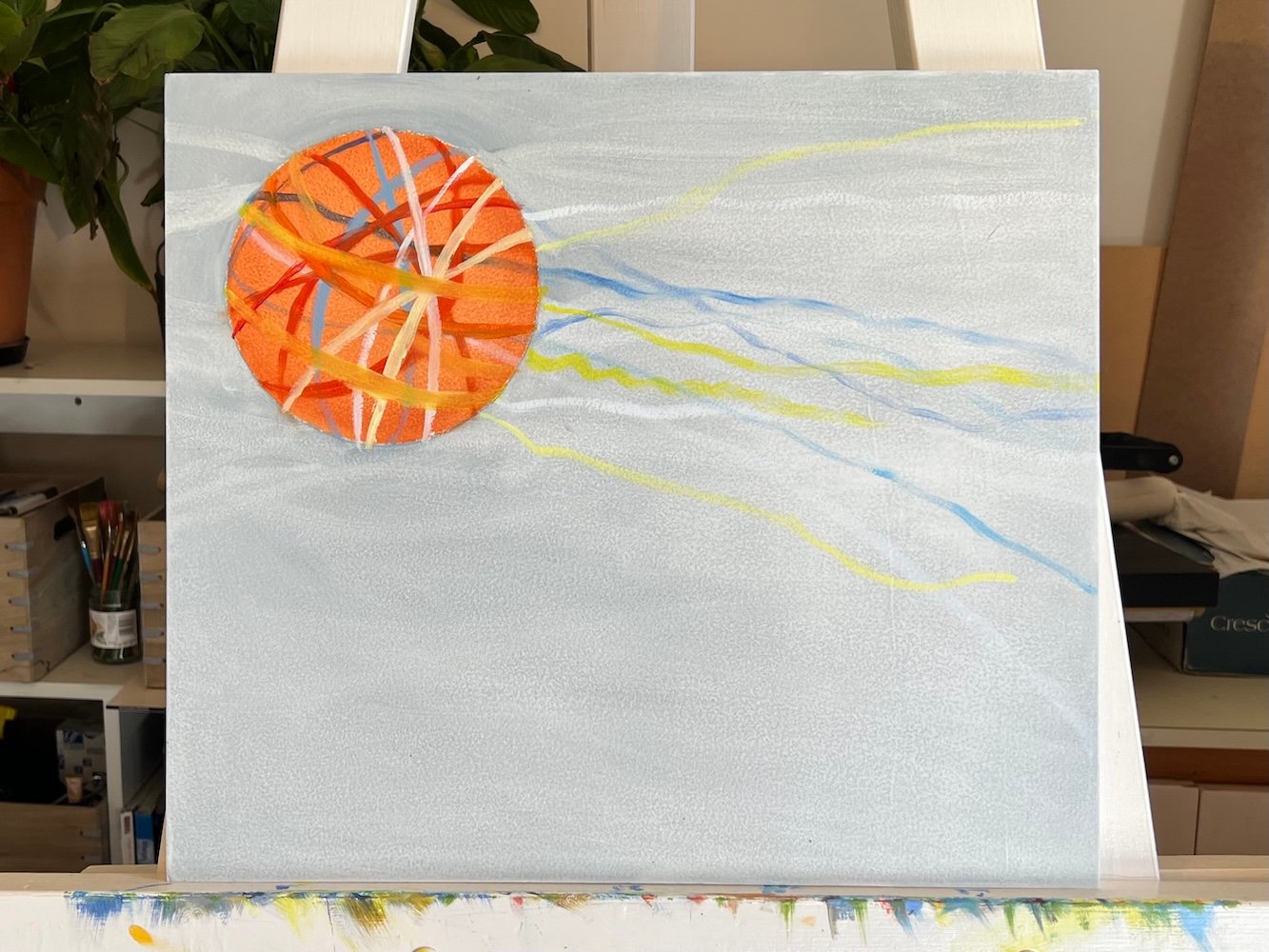
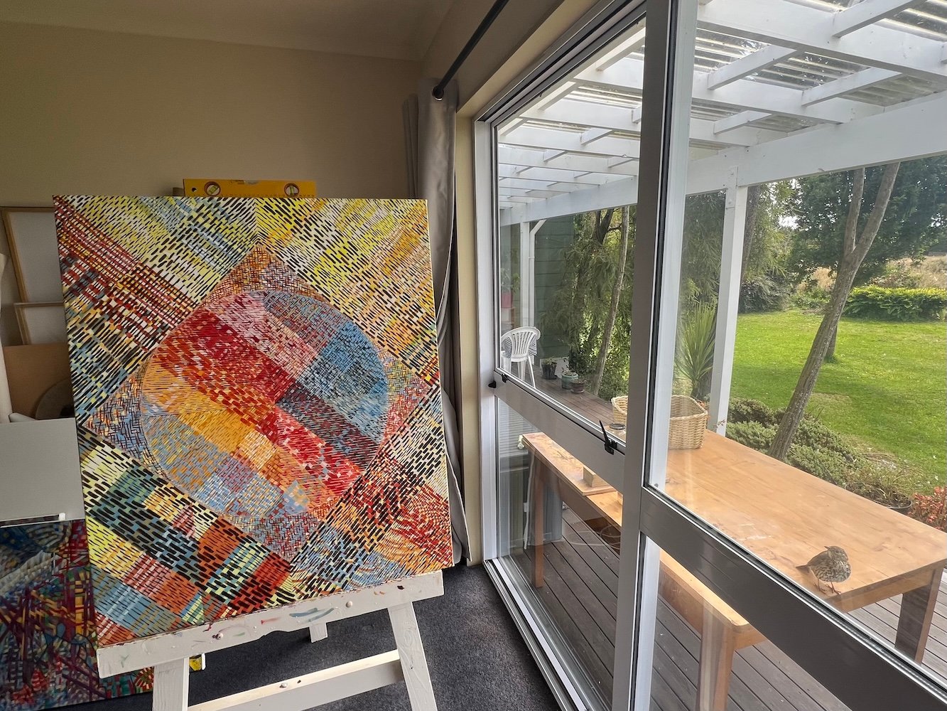
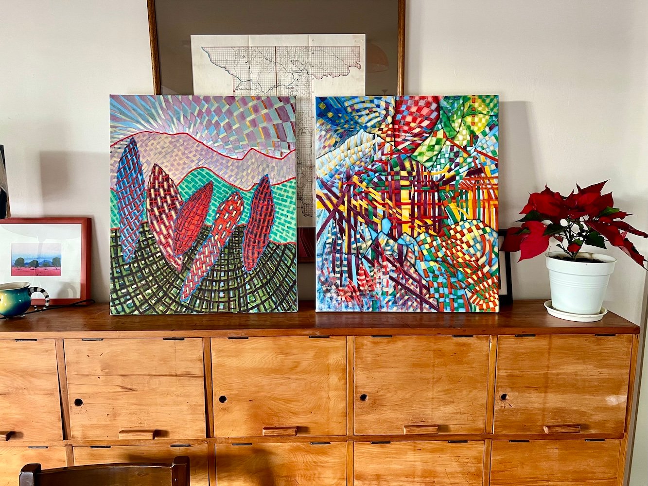
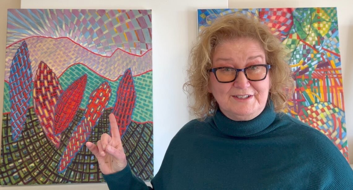
Perhaps the real story to be celebrated in the ‘Pink Chatter’ collection is that of persistence.
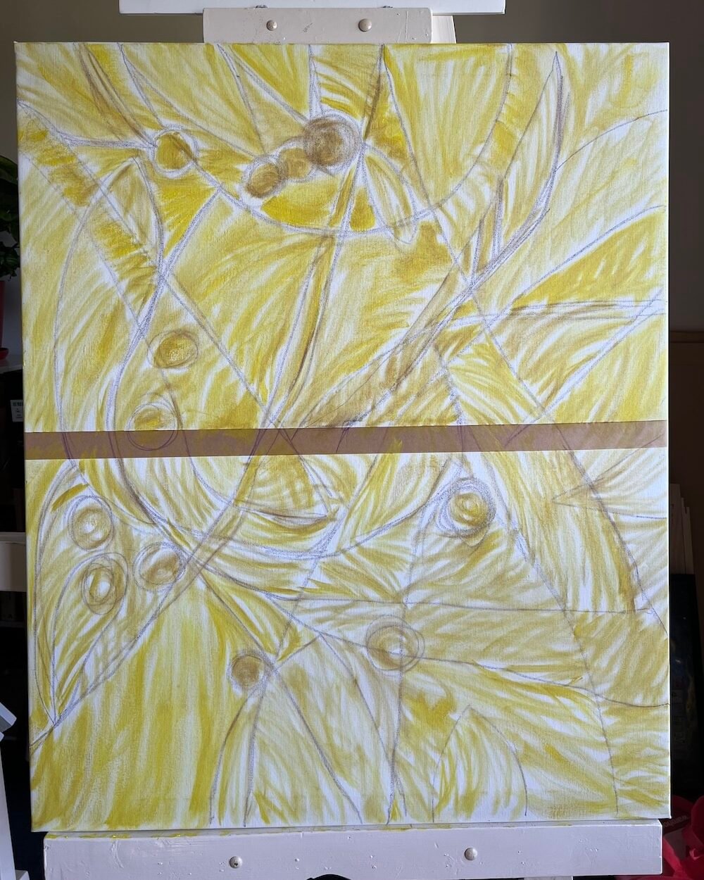
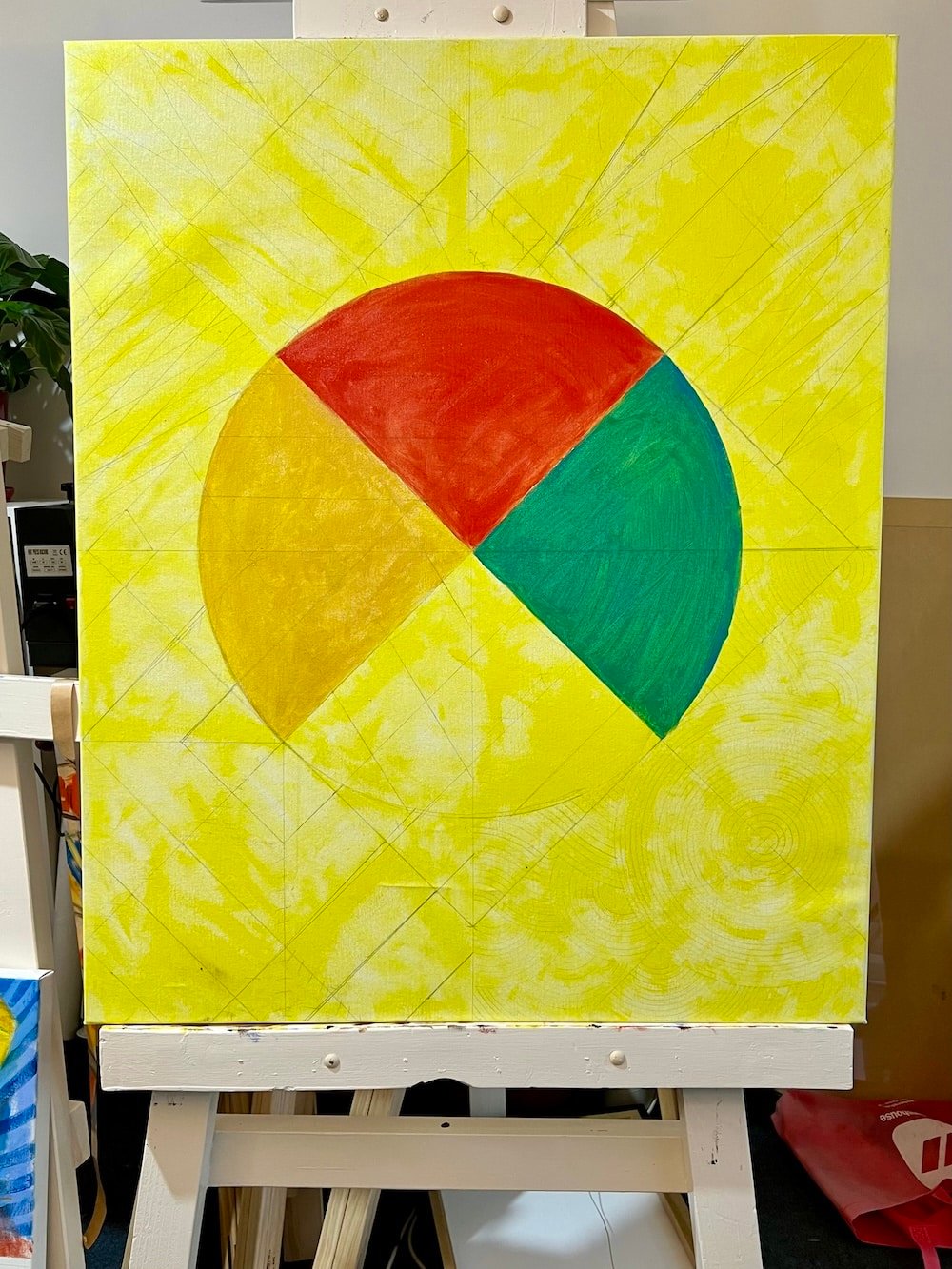
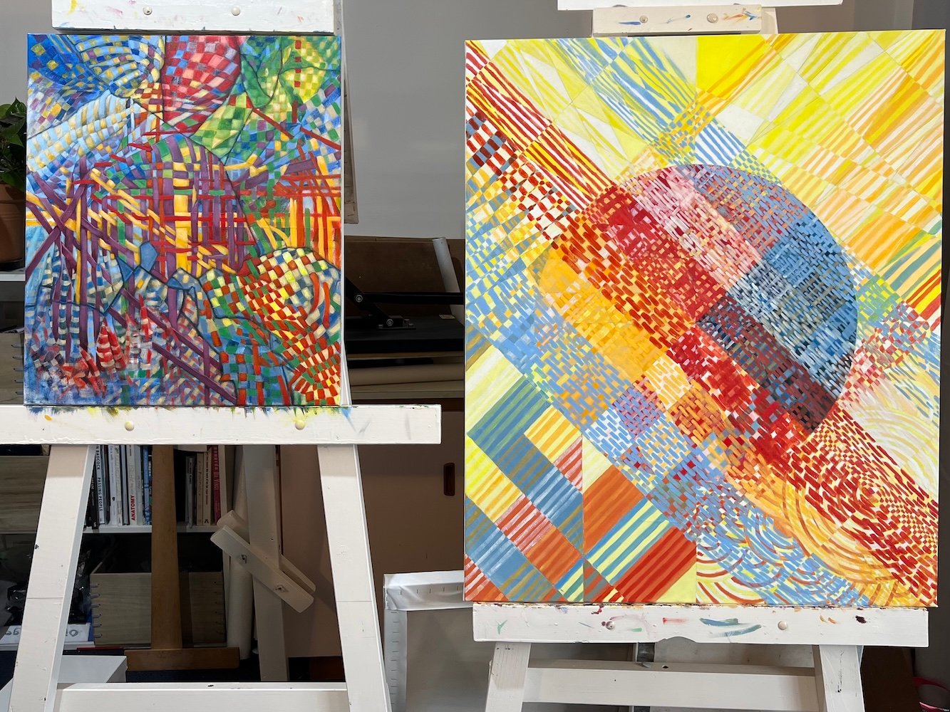
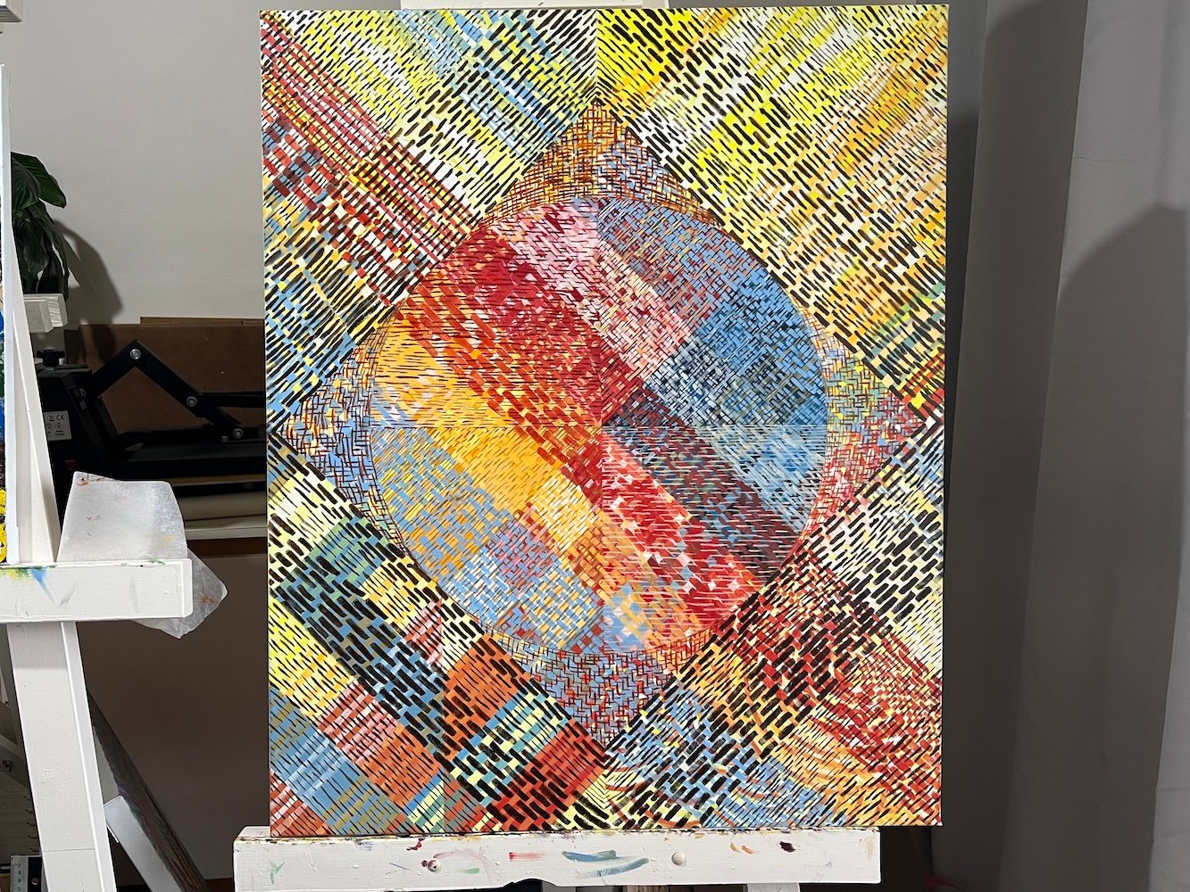
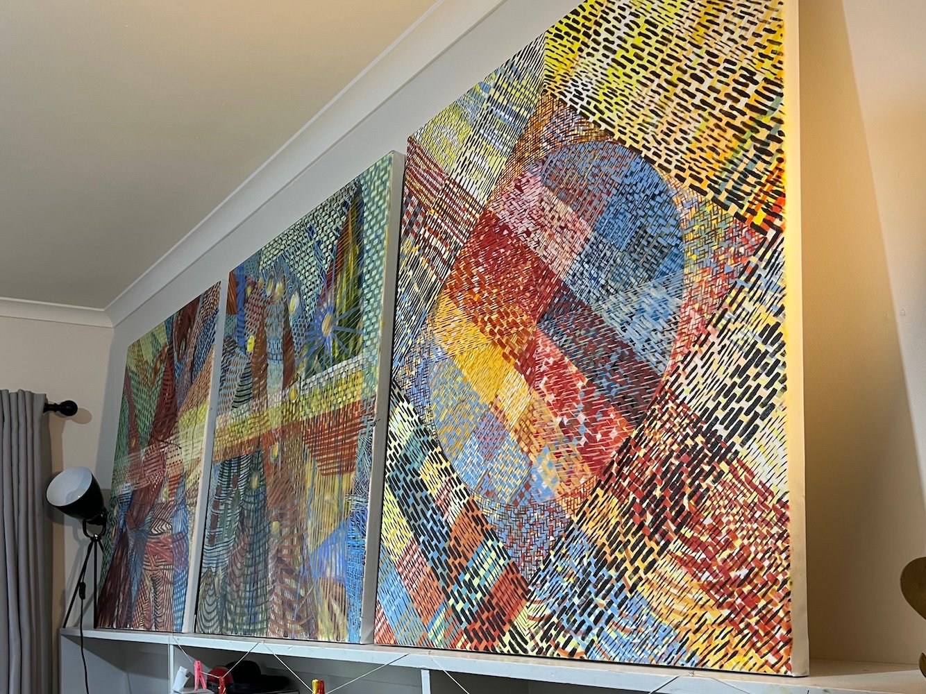
Begun March 2024, final strokes were placed last November 2025.

My passion for narrative realism reignited with the birth of my children in the mid 1980’s. Most works in my burgeoning child portraiture business in California were made using professional coloured pencils on Bristol and Mi Tientes papers.