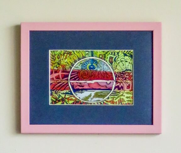
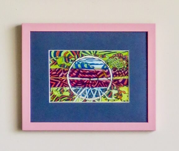
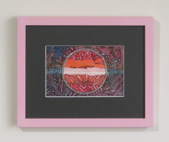
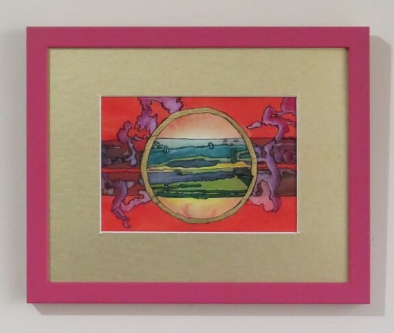
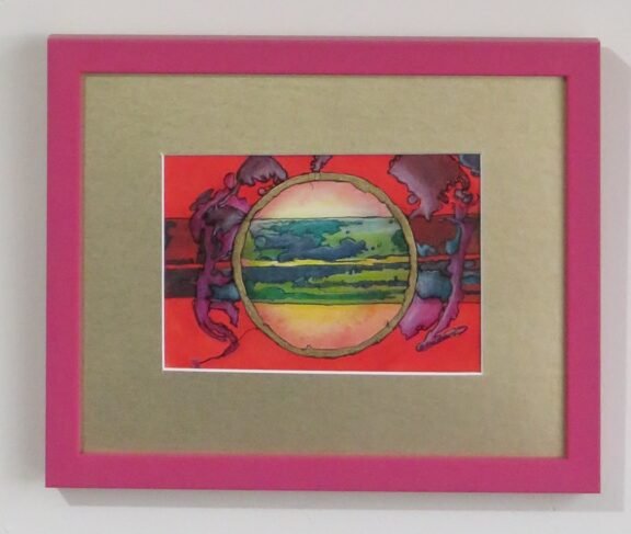
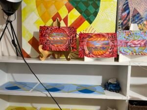
Throwing out the rules of art was paramount in my desire to loosen up and have more fun.
As a naturally compliant woman that likes the tried and true, I pondered what would happen if I intentionally played at making art! Taking things too seriously had become tiresome!
Pink frames and avoiding precision
Wasting time, materials, and money was to be avoided. So, I devised some guidelines to help.
First, I asked, ‘what’s in my hand’. Six pink 8×10 inch picture frames left over from a promotion at my by-gone business would hold my new works, which were created on archival watercolour paper founded amongst a stack of art books.
Other guidelines were to avoid precision and self-criticism. The six works required a bit of cohesion, so I used identical Inktense colours to make a circle and a horizon line on them all. They needed to look good in the pink frames, without being overtly girly.
Free-flowing media and dutch gold leaf
Lines flowed from my pigment ink pen whilst I amplified emerging shapes that came from flow of the Inktense as it dried on the paper. How would I play wth those lines? Coloured pencil tweaked the shades, to my delight. If I something seemed off I’d make different marks. Or, just live with it. This worked surprisingly well.
Next came dutch gold leaf and silver leaf. Originally, I wanted copper leaf on one pair. I was fresh out. Silver and gold would do.
Adulting for a few days and other world affairs
The only “un-playful” aspect of this playtime was the 3 days spent moving equipment and supplies in order to properly set up my mat cutter. The remainder of the year shall now be more rewarding. I can play in the studio and then properly mat and frame the results for display.
While I was in my art space playing. I had to block out the news of the Ukraine invasion and changes to Covid regulations in NZ. I wonder how these events influenced my works.
Throwing out the rules with names
The final fun was choosing light-hearted non sequitur titles for the works. In enjoyed even more throwing out the rules! I hope you enjoy them. Which title is your favourite? Which visual is your favourite? Please let me know in the comments.
