Choosing Monochrome
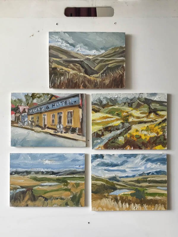
Choosing to use monochrome colour is on tap for this Day 5 work from our trip deeper into the Kyeburn Diggings. Yesterday, cutting back the chroma to show the muted colours of the Danseys Pass took a lot more time than I’d planned. It’s Friday and I have weekend plans.
High contrast is my principal tool today. Aerial perspective helps too. Darker and warmer colours are used close to the viewer. Lighter, less saturated, cooler used further away.
I’m really pleased. Choosing monochorme worked better than imagined. Very well. The painting sold almost immediately on Instagram! I’ve posted an image of the work for you to enjoy.
Be sure to watch the time-lapse video below.


