How to Analyse Your Art Work

How to analyse your art work.

Red Playground – Finish what you started’ is now finished and ready for me to frame later this year to sell.

Before I can truly move on from it, I want to analyse it.  A month or so has lapsed, in real time (rather than YouTube time). My eyes and brain have had a good rest from everyday concentration on the piece.

Why analyse your art work?

Analysing your artwork helps you, the creator, better understand the success of a finished work. You learn to talk about your work using the language of art.

Motivation and Rules

Motivation is a huge thing for me. So embracing  a few elementary rules to stoke motivation seems good.

My motivation is simple: I want to relax in the studio and have playful fun after emerging from an intense four years. I explore abstraction as a break from the stress of preparing for narrative realism work. I want little pressure in the studio.  Other than just simply doing, I have few demands of myself.

Even the best play is better with a few rules.  Keeping it simple and stress-free is dear to my heart. My rules:

  1. Use the supplies I have on hand until I totally run out. I have a lot left over from the former business.
  2. All new work is a derivative of previous work.  Click here to read my tribute to Allie Eagle to find out why I choose to do this.
  3. Embrace the idea that there are no mistakes; only opportunities to discover something new.
  4. Create 52 works by May 2024.
Creating Art Around Life

Enjoy the curated time-lapse video set to music with highlights from each day of creating “Red Playground, Finish what you Started”. No talking.


Meditative and relaxing.


I’d appreciate if you’d subscribe on YouTube and hit the bell to be notified when I upload the next video of the series.

Or, better yet, click here to join my email list to get first notification and occasional updates with news, free downloads and other special things I’m working on right now.

Bold Or Confronting
'Red Playground - Finish what you started'
Time for Analyisis

Guidelines set for the 'red Playground series'

Explore Inktense properties

Inktense is a medium with which I became familiar when I created several ‘Out of Hand’ works with it. I see this as a time to further explore its properties and learn more ways of working with it, including finding the best method to get permanence in a layer before applying the next.

Use primary colours

Using primary colour helps me avoid the concern of pre-mixing colours.

Pretreat the support paper

Discover new ways to pretreat the support (paper)  and make note of the effects made.time

Caught!
'caught' from 'out of hand' was created with inktense

the language of talking about art

Analysing art includes talking about elements and principles of art. I’ll demonstrate a use of them in my analysis of ‘Red Playground – Finish what you started’.

The elements

The elements, colour, line, shape, form, texture, value and space are to used to create a work and express the principles of art.

The principles of art

Balance, contrast, movement, pattern, rhythm, unity, emphasis and proportion are art principles providing a framework in which to talk about art.

An artist can choose to employ elements in ways to affect the principles.

My analysis of 'red playground - finish what you started'

Art analysis using Elements

Line

Pigment ink pens finalise linear elements created with the Inktense and enhance design.

Shape

Circles, triangles, lines and squares in this work create pleasing designs as well as balance and direction.

Form

Created by changing intensity of the application of Inktense.   Coloured pencil enhances the circles sense of form.

Space

Initially a lot of space exists around the circles until I added strong inktense colour, and follow up with designs in pigment ink.  In the early stages, I left the arcs of the circle empty and celebrated the process by playing with the earlier misguided graphite marks.

Texture

Pretreatment of the support involved soaking, staining, drying, soaking again and drying again, followed by steam ironing. The lively red pattern across the crunchy paper gives it tactile and coloured texture. Additional Inktense, pigment ink, and coloured pencil added little extra texture, if any.

Colour

I loved the results from layered primary colours over each other, especially over the pre-treatment red.

Value

The strength or intensity of the alternating stripes on the right side earlier demonstrated the effect contrasting value can have on a work.  I counterbalanced the difference in value (and contrast) by adding Inktense design in the lighter valued yellow.

(continued below)

Red Playground, Day 3
Linear elements created with inktense before pigment ink.
Adding Texture To The Support
Texture added by pre-treatment of support with inktense
Red Playground - Finish What You Started, Final
Red playground - finish what you started. Complete.
Flame Effect In Upper Left Quadrant
Flame effect from yellow over pretreated support

Analysis using principles of art

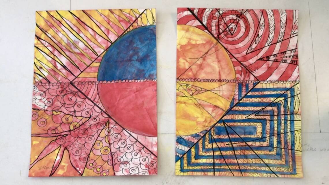
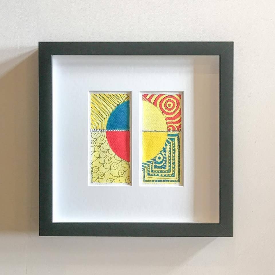
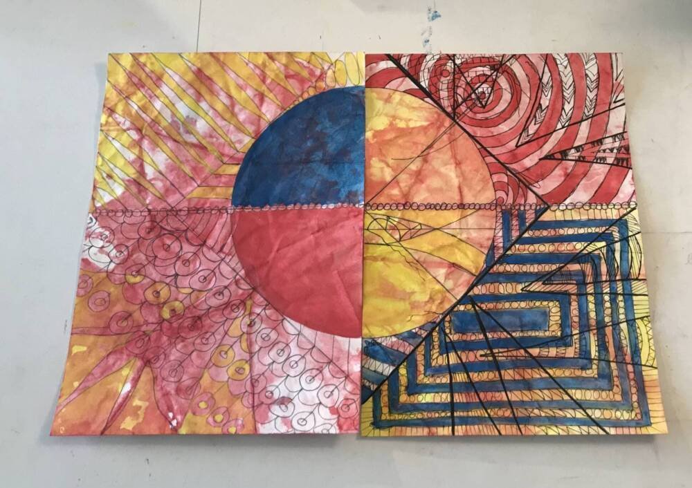
Balance (symmetric, asymmetric, and radial symmetry)

The circle inside the square provides a sense of symmetric balance.  A nod to asymmetric balance is given in both bottom portions and the right upper large pointers.  Counter-balance is offered in the upper left with the row of pointers aimed at the blue semi-circle.  I found myself fighting the strong radial symmetry of the right side, which gave rise to the large strong pointers.

Contrast (including juxtapositions)

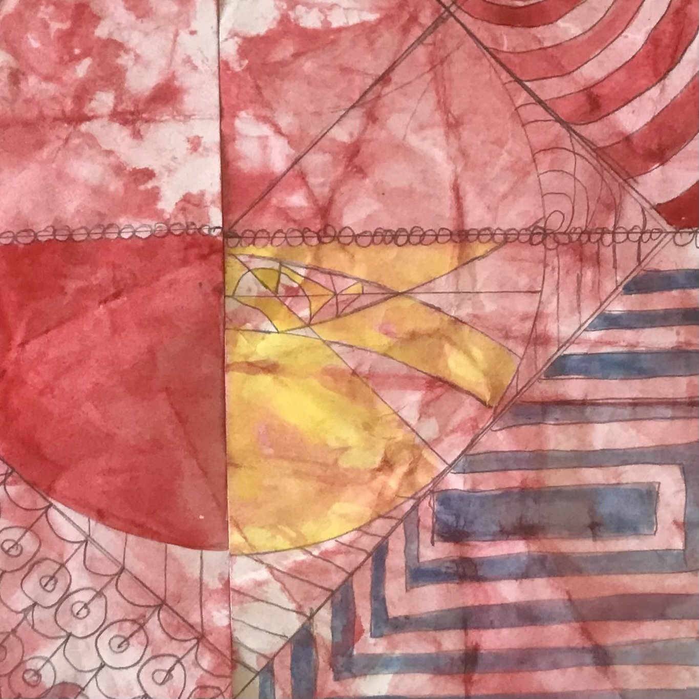
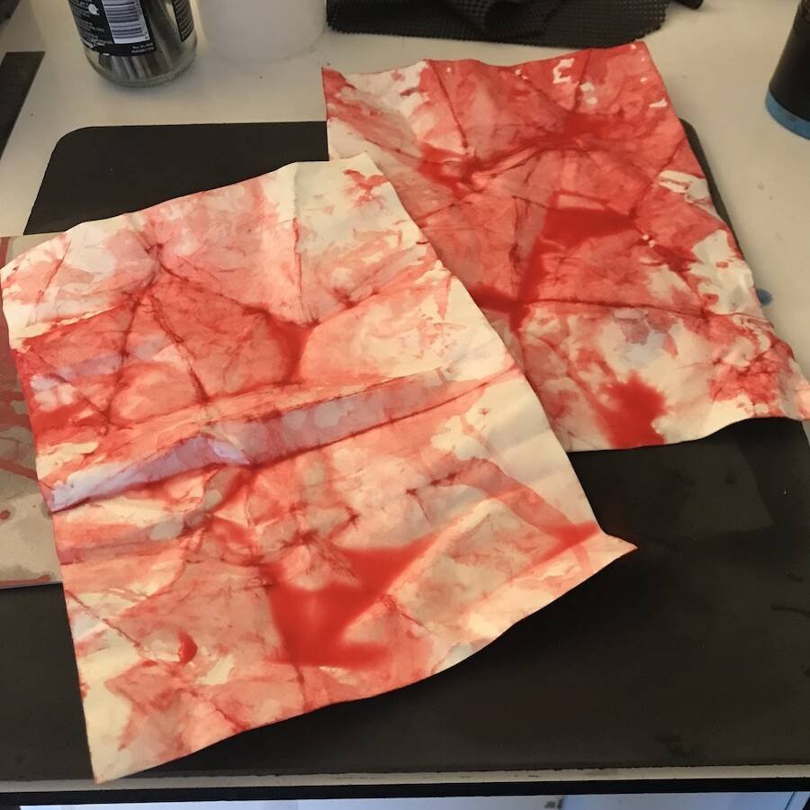
I like the vestiges of the original graphite marks on the right half circle. The pigment ink tracings give direction over to the other side of the diptych. The pretreatment of the paper shines through particularly on the blue and red segments on the right side.

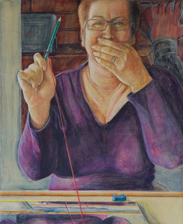
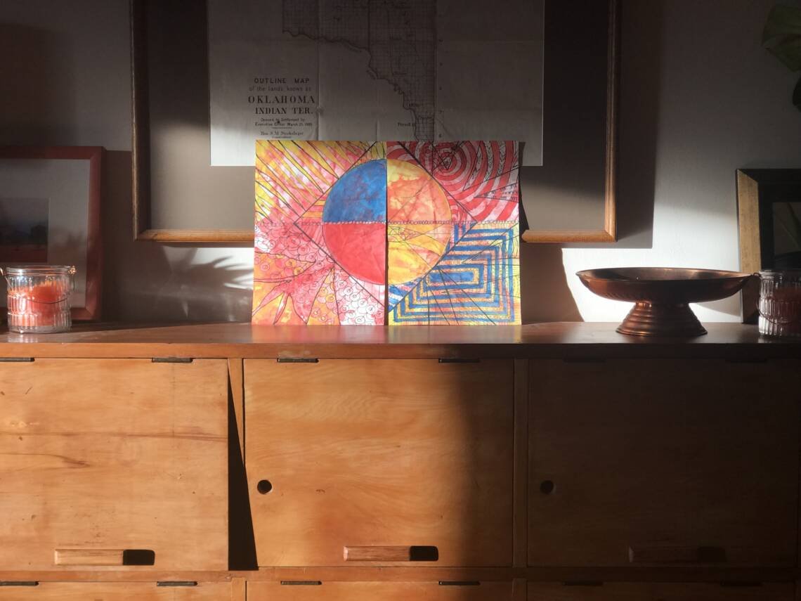
I ask my husband for his thoughts on the completed work. That’s a risky endeavour, you may think, but I consider it one of many benefits of balanced, long-time marriage; truthful discussions with no fear of repercussion. I also value his opinion as a non-artist. 

He suggests the left side has more contrast than the right side; further offering that he isn’t sure the red and blue belong there at all.  Interesting. 

The artist in me views it as a counterbalance to the frenetic design of the right side, and considers it a nod to the original piece from which this one is derived.  What do you think?

Movement

Strong alternating circles and rectangles on the right side draw the eye into their respective centres.  I’ve taken care to draw the eye downward and toward the centre and over to the left, in a clockwise movement, enhanced by the curved stripes in the right top and bottom.

Pattern (repeat of an element)

Stripes and more stripes, circular and rectangular, are in the right half, and in designs within the square surround the circle in all quadrants.

Rhythm

The repetition of the pointers, except in the upper left gives rhythm.  I thought the number of smaller pointers would balance the larger pointers in the remaining quadrants. I think of the erratic rhythm of fireworks and firecrackers.

Unity/Variety

The circle and the encompassing square, along with the strong pointers give a kind of unity to what could, otherwise, be a frenetic work.

Emphasis

My husband says the first thing he sees is the red and blue semi-circles on the left side.  I’m surprised because I of my concern about the strength (of contrasting) stripes and rectangles on the right.  Perhaps, this means I achieved what I set out to do, which was to decrease the contrast.

Proportion

I’m pleased with the balance of the proportion of the circle quadrants with the design outside the circle. I achieved a kind of proportional balance with the pointers.

Red Playground - Finish What You Started, In Situ

what I've learned from creating 'red playground - finish what you started'

Did I honour my motivation and rules?

Simply, yes.  In spite of the interruptions that come with a full-on life, alongside the hectic video-creation process, I’ve manage to laugh a lot.  In fact, I’ve had to edit a lot of it out, whilst having a blast in the studio. Mostly.

By using geometric shapes, for simplicity, I’ll now integrate new things learnt into more complex future work.

I’ve acknowledged each of the rules so far.  The number of works needed within a tight timeframe frees me from the re-working marks I feel could to be improved.  No time for that.

The biggest win is the ability to create on the fly and not agonise (as much) over an imperfect mark; move on quickly and create more. I think the collection of ragged imperfect marks attains new beauty en masse.

What about those guidelines?

The guidelines for Red Playground series are met in that I’ve continue exploring the properties of Inktense.  Importantly, I’ve learned how to make a layer colourfast before adding the next.  The success of mastering this colourfastness is evident in the resulting work. Layering thin primary colours over the pre-treated support evokes a magical flame-like effect.

Because I’m in a year of exploration I choose to not entertain what I could do to improve.  I battle against being hypercritical the further I analyse, which is in direct contravention of my aim to play.  Perhaps that assessment will come later.  No pressure.

Can Red Come Out To Play, Vii, Turned On Side
Can red come out to play, vii, turned on side, inspires the new work.
Red Playground - Finish What You Started, Final
Red playground - finish what you started. Complete.

the relationship to the original

‘Red Playground – Finish What you started’ was inspired by can ‘Can Red Come Out to Play VII’, from an earlier series of mine. How do the two relate to one another?

The second work seems to thunder and clap; I’m thinking,Tchaikovsky’s 1812 Overture. Nearby stands its quiet, almost lyrical forebear; likened to a beautifully sung rendition of ‘The Banks of Loch Lomond” with pipes and drum. Both are similar in the theme, victory and loss, but each displays its own timbre and atmosphere.

They are related.  But distinct.  I like that.

The last word

Gazing at ‘Red Playground – Finish what you started’, sitting on top of vintage rimu New Zealand high school lockers that I refinished last spring, satisfaction washes over me. The artwork, interrupted for a season, is now complete. It lives on to inspire future work.

Leaning against an original 1889 lithograph of the Outline Map of the lands know as Oklahoma Indian Territory, a keepsake from my parent’s collection of earthly goods, the newest work sits comfortably midst the bygone. The fading winter sun gently illuminates the tableau. Gum wood snaps and pops in the fireplace, as I sip my hot cup of tea.

I savour the satisfaction and amazement of how simple plodding, planning, and focus continues to shape my life. 

How To Analyse Your Art - Red Playground - Finish What You Started
Red playground - finish what you started. Complete.

What do you think of my analysis of my artwork?  In what ways do you analyse yours?  What difficulties do you find in analysing your own work?

Please let me know in the comments below.

Click here to join my email list to receive monthly updates of what is going on in the studio. I can notify you when the latest video and blogpost go live.  Simply respond to one of my emails and tell me. 

Those on my list will receive other benefits I’m working on right now, including having first dibs to purchase works later on this year.

I’d appreciate you watching the video, a curated time-lapse set to music. I find it meditative and relaxing.  Click on the video box on this post.  Or, click here to go directly to it on YouTube.  Please like it on YouTube if you enjoyed it. Then, comment, either here, or on YouTube.

Click here to go to the first session of this series, titled, “10 Things I did to love myself this summer so I could get back to creating”

Is there a better title?

‘Red Playground – Finish what you started’, is a working title. I’d appreciate your suggestions for a final title. Post them in the comments below or in the comment section on any of the videos of the series.

share
Scroll to Top