'Moving on', a Significant Studio Conquest
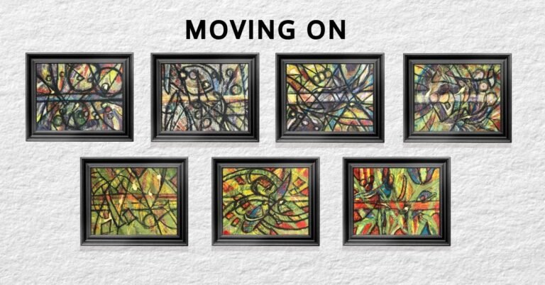
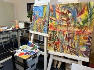
‘Moving On’, a significant studio conquest and personal victory, arises from a year-long dive into abstraction, after a life-time of narrative realism. Moreover, overcoming problems encountered in making the series rewarded me with even greater confidence.
It is a profound emotional, spiritual, and practical journey of overcoming the madness of the pandemic. Indeed, my own personal insanity of closing my business and living in my home during a major repair added to the malaise.
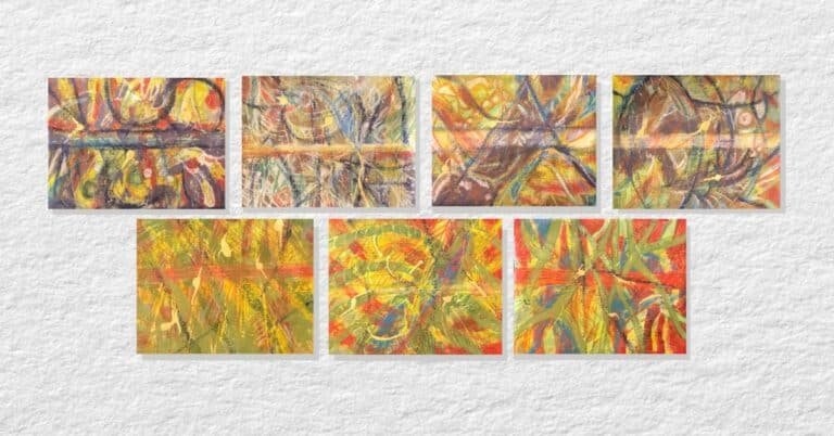
The collection is the first set of works debuted from my 52-works-in-52-weeks quest. They are directly inspired by my 2018 series ‘Wabi Sabi’.
materials and Methods shaped 'Moving on'
The works tested my resolve to succeed with oil-based printing ink which I’d encountered at a Sue Cooke printing workshop in 2021. However, printing on canvas sheets was not as straightforward as the paper I’d used at that weekend at the Gore Arts Centre.
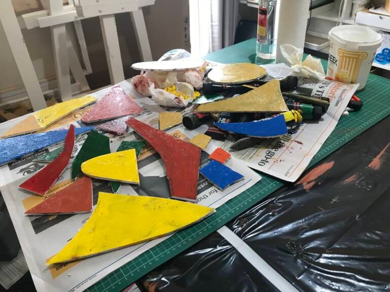
Onto the canvas I placed marks of printing ink brushed onto acrylic sheets or rolled onto cut-out foam board shapes. These were pressed onto the canvas with rollers and, if needed, smashed even more firmly with a cold t-shirt press. Then marks were made with, oil sticks, Caran D’ache crayons, scrapers, and anything usable, including metal leaf, completing the works.
Oil-based printing ink profoundly impeded progress. Indeed, the stickiness and clean up was onerous. However, quitting was not an option. Certainly, I decreed change was a premiere goal of my year-long quest, so, this was the path on which I’d stand fast.
Play is important. However, this proved to be a playground brawl! Accordingly, I stood my ground rather than run away, as I might have as bashful Kansas schoolgirl.
Primary colours were crucial for making optimistic works. However, adding earth tones rendered them more palatable. Movement and structure was added with a latterly swish of black oil stick.
Additionally, the techniques used mirror the intricate and often tumultuous process of moving forward from life’s difficulties. The collection confirmed my readiness to move full-throttle into abstraction. Therefore, it is a significant studio conquest.
a beneficial break from the studio
Originally, the collection was “finished” in early October 2023. However, the works beckoned for ‘something more’ upon my return to the studio from summer break last February. Without a doubt, resting my brain and eyes bestowed a refreshing new perspective on the work. Finishing marks were placed starting in late February, with all the pieces complete this past April.
The collection represents a profound emotional, spiritual, and practical journey of tackling loss, sorrow, and grief that ultimately leads to restoration and peace.
The individual titles, likewise, show my readiness to ‘move on’ and are light-hearted and joyful.
Notes on the individual works
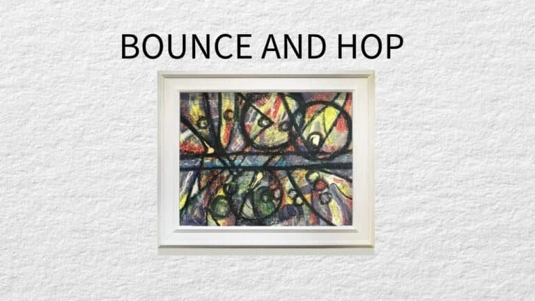
'Bounce and Hop'
‘Bounce and Hop’ is inspired by ‘Wabi Sabi No. 1. Circles offer balance and keep the eye moving around the piece with triangles pointing the way.”
Surprisingly, muted purple tames the frenetic red on top of yellow. Grey, orange and light pink ameliorate potential tussle between complementary violet and yellow.
Scraping between layers adds texture and direction, and is particularly useful in taming the impact of the black oil stick. Additionally, Dutch gold adds a bit of sparkle with pigment ink offering final flourishes to this textural work.
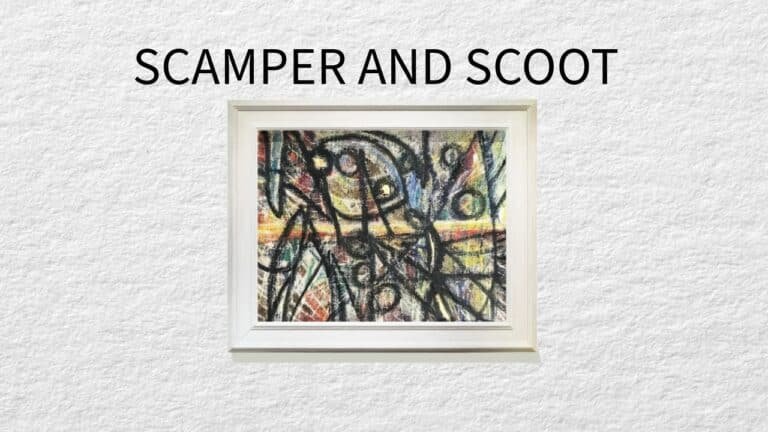
'Scamper and Scoot'
‘Scamper and Scoot’ emerges from its early ugly duckling stages by transforming into one of my favourite works.
Applying print ink onto the canvas surface multiple times renders only faint impressions. To compensate, I add a variety of oil stick colour, followed by lots of scraping.
The work’s metamorphosis is attributable to the break taken before adding final black oil stick marks. The work is inspired by ‘Wabi Sabi No.2’.
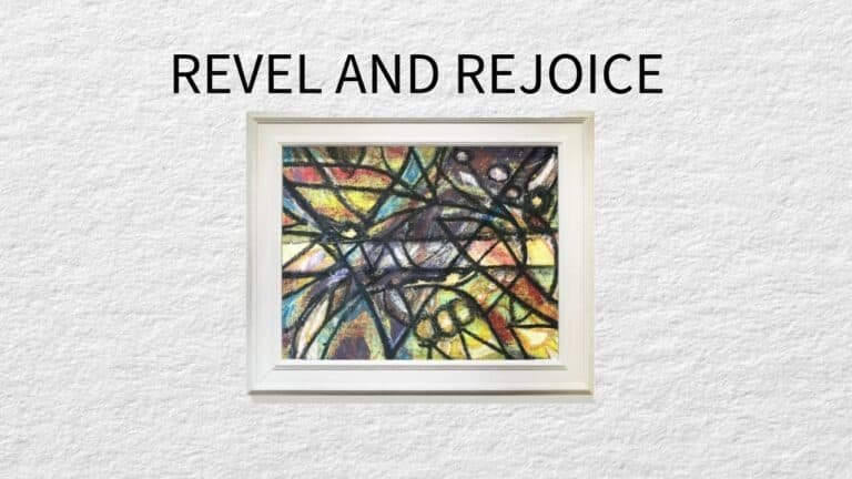
'Revel and Rejoice'
The Peter Max-influenced floral and circle design of ‘Wabi Sabi No. 3 are down played in its current iteration, ‘Revel and Rejoice’. Instead, a mountain-like theme emerges to which circles and leaf shapes are integrated.
An array of bright colours, that could otherwise be riotous, are tamed by the undaunted use of black oil-stick, with equally bold scratches to give the composition grain and direction.
'Gambol and Flit'
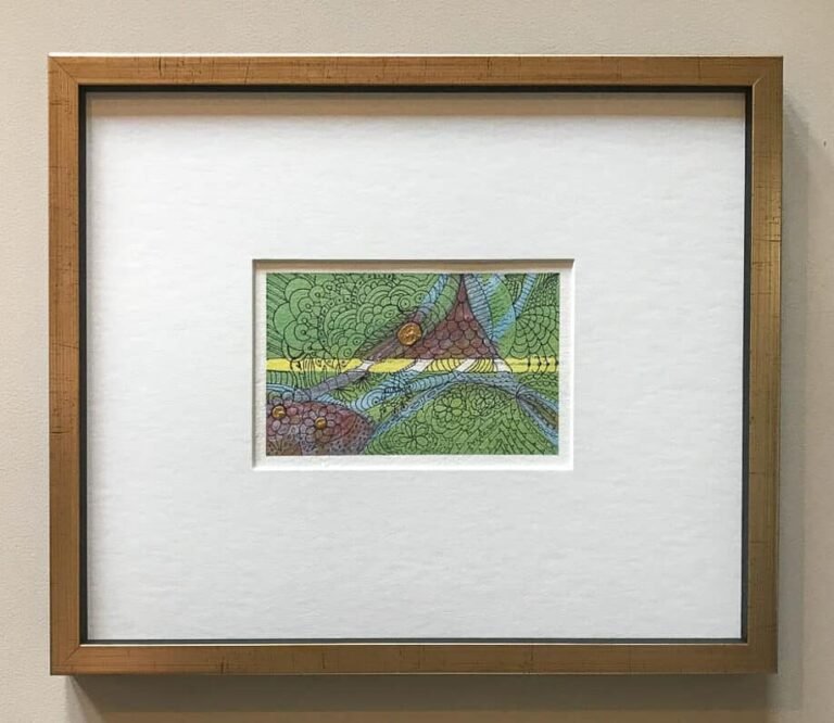
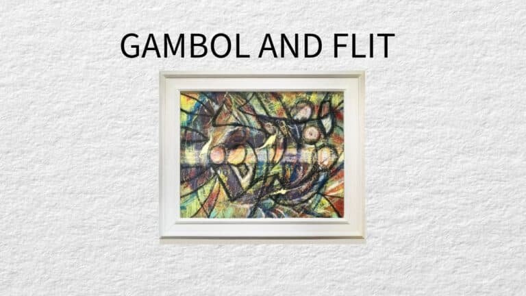
‘Gambol and Flit’ is an optimistic re-imagining of Wabi Sabi No.4. The earlier work somehow seems other-worldly, think sea creatures on the ocean floor, most likely mirroring my inner forebodings at the time it was made.”
As in the other works of this collection, this is ultimately rendered with an optimistic outcome.
Similarly I use bold colours and lines, yet, this one imbues a more sophisticated, but joy-filled character.
'Hustle and Hum'
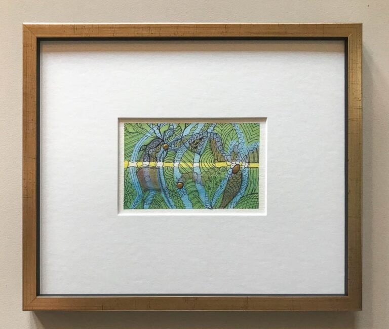
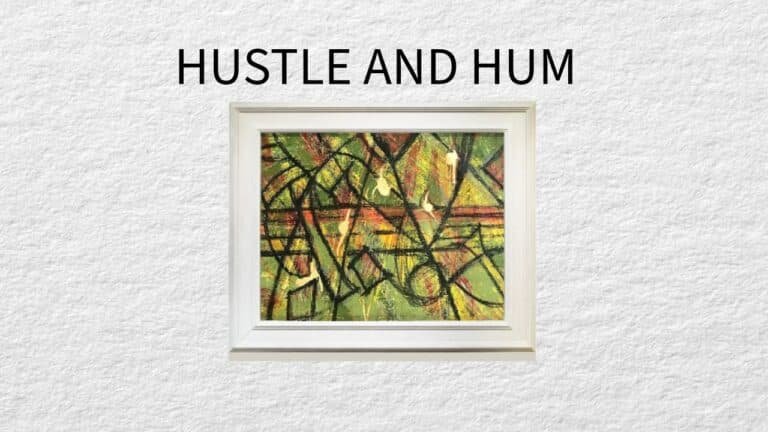
‘Hustle and Hum’ springs forth from ‘Wabi Sabi 5’, a verdant work redolent of a bamboo jungle. Canes merge into triangles in the latter work, suggesting lush mountain vistas.
Significantly, my aim is to coerce green and red to play nicely with each other, on top of a canvas of yellow overtones.
In the end, the emboldened black oil stick lines, especially the 5 horizontal mid lines calm the fracas down.
'Tango and Twist'
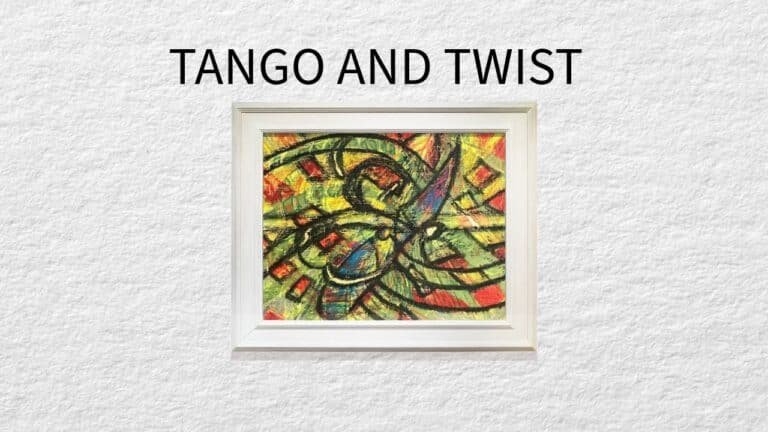
‘Tango and Twist’ challenges me, in part, because its predecessor, ‘Wabi Sabi 6’ possesses strong colour and design elements.”
Additionally, the acrylic sheet with red print ink applied to print the design is inadvertently flipped upside down on the canvas, complicating things a bit.
Of course, I want to really push the boundaries for ‘Moving On’, so, the same design, now using green is impressed in the opposite direction. Varied shades of green, and blue along with judicious use of orange ever so slightly calms things down.
Once again, bold black stick rules the melee. Ultimately, ‘Tango and Twist’ IS a flamboyant work.
'Frolic and Romp'
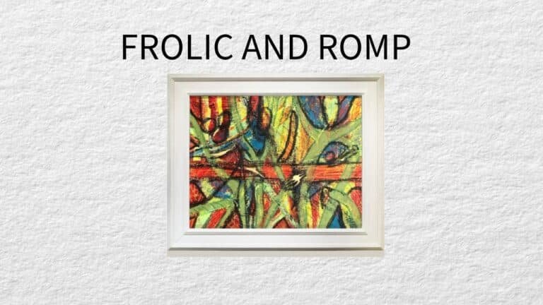
‘Frolic and Romp’ serves as a de facto companion piece to Tango and Twist.
Indeed, its forerunner, ‘Wabi Sabi 7’ is similar in colour and design to ‘Wabi Sabi 6’.
In the end, ‘Frolic and Romp’ may be less ostentatious than its partner, nonetheless, organic forms almost seem to triumphantly dance across the canvas, lending a sense of movement and fluidity to the composition.
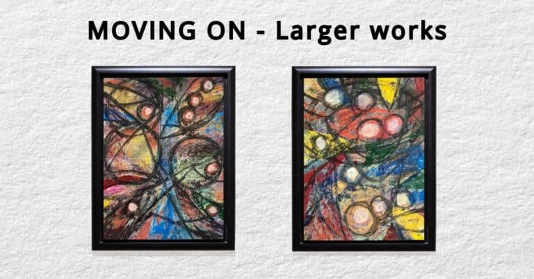
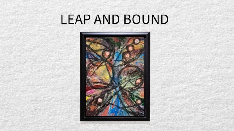
'Leap and Bound'
‘Leap and Bound’ draws significant influence from its predecessor, ‘Bounce and Hope’.
Altering the orientation between the two works fundamentally shifts the perspective, creating a fresh interpretation. The vertical orientation suggests an upward struggle and resilience, encapsulating a sense of aspiration and perseverance.
As a final touch, I stretched the artwork onto a canvas frame, elevating it from a flat artwork to a dynamic, three-dimensional entity.
In essence, ‘Leap and Bound’ not only pays homage to ‘Bounce and Hope’ but also expands upon its foundation. I sought to create a work that explored movement and transformation in an innovative and compelling way.
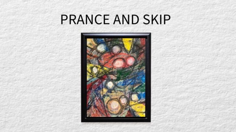
'Prance and Skip'
‘Prance and Skip’ draws inspiration from the earlier ‘Gambol and Flit’, evoking a sense of freedom and joy. At the same time, I aim to capture the fluidity of life journey marked by moments of lightness and grace; much like the carefree movements suggested by the title.
‘Gambol and Flit’ is a whimsical exploration of motion and change. In comparison, ‘Prance and Skip’ embodies a more refined and deliberate movement. While ‘Gambol and Flit’ relies on spontaneity and exuberance, ‘Prance and Skip’ shows a more considered perspective.
'Moving On', What This Collection Means to Me
In seeking to make works that are vibrant and joyful, my hope is they inject a bit of optimistic zing to the future owners’ spaces. The real bonus from creating the collection is that overcoming problems encountered in making the series rewarded me with even more confidence. Therefore, it offers surety that abstraction is a path to pursue.
You can see and purchase from the “Moving On’ collection by clicking here.
I encourage you to join my email list so you can be the first to check out my new works as they debut. See ‘Hurly Burly’ by clicking here. Join my list to be able to purchase the next collection, Hurly Burly, at email-list-only prices.
The Remaining 52 in 52 Works
By the time this post is published I will have completed or nearly completed most the 52 works in 52 weeks collection. Ultimately, the purpose of the challenge was to motivate me to create alot of work. I’ve certainly achieved that. However, I must give myself more time and not rush the process so that I end up with works I like.
I’d love to know what you think about the series ‘Moving On’ in the comments below.


